Tufte defines the essential task of information design as facilitating an escape from "flatland", by which he means the two-dimensionality of paper and screens.
He says: "all of the interesting worlds - physical, biological, imaginary, human - are inevitably multivariate in nature, a conditions at odds with the flatlands of our information displays." This is analogous to the problems that architects face when describing the complexity of the contemporary context through straight-forward architectural graphic projection.
Towards the end of escaping flatlands, in his first chapter, tufte describes a range of information design strategies that, given the baseline of conventional approaches, sharpen the "information resolution" of data presented on paper and video screens.
Increase the number of dimensions that can be represented on planar surfaces, and we increase the data density (the amount of information per unit area)
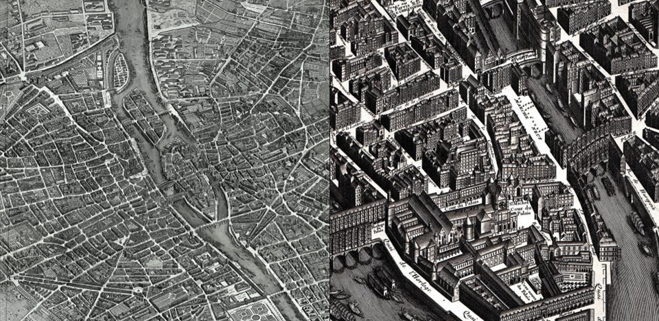
Here we see a fine texture of exquisite detail that leads us to understand human-scale mirco-readings, individual stories about the data.
This detail in aggregate combines into larger coherent structures
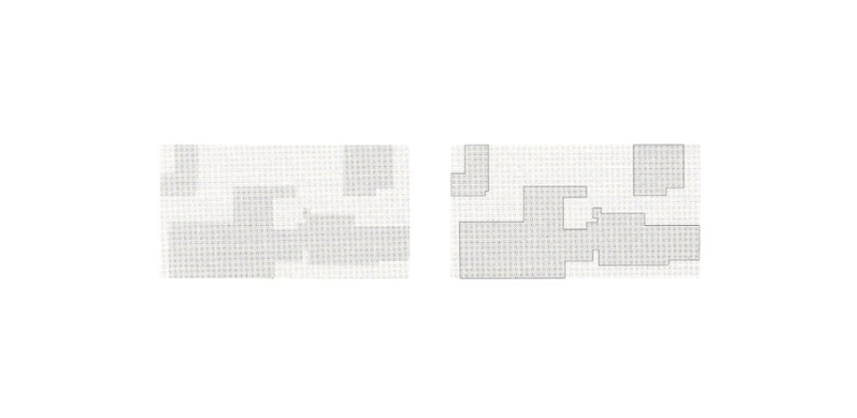
In this large-scale axonometric of paris... thousands of tiny details, when seen at a distance, turns to grey to suggest the unity of a block or district. This simplicity of overall reading derives from detailed and complex information.
This leads us to an unconventional and unexpected information design strategy: to clarify, add detail.
What follows is a detailing of five essential strategies for information design as seen by Tufte.
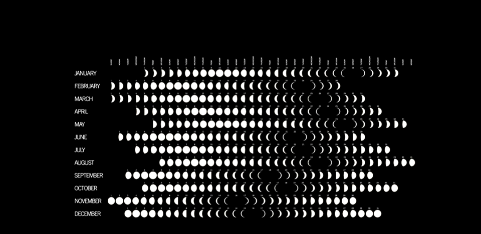
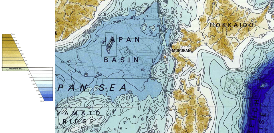
Micro-Macro Readings
The first is what he terms "micro-macro readings", which is to say the simultaneous use of multiple scales to communicate complex detail while maintaining the simplicity of an overall reading.
This strategy facilitates a freedom of choice in the viewer, who may both take in an overview, while also maintaining the capacity to compare and sort through detail.
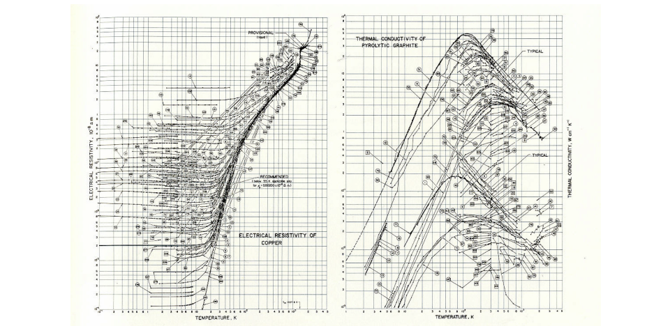
Such designs can report immense detail, organizing complexity through multiple and hierarchical layers of contextual reading.
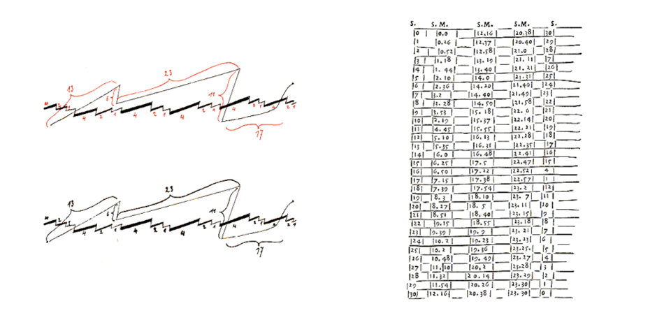
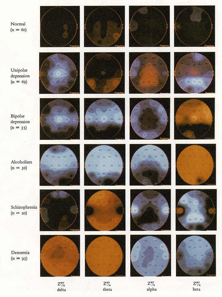
These graphs report a clouded relationship between temperature and conductivity for various elements, as measured by many different laboratories.
Each set of connected points comes from a single publication, cited with an identification number.
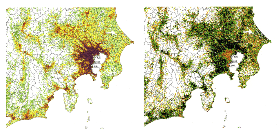
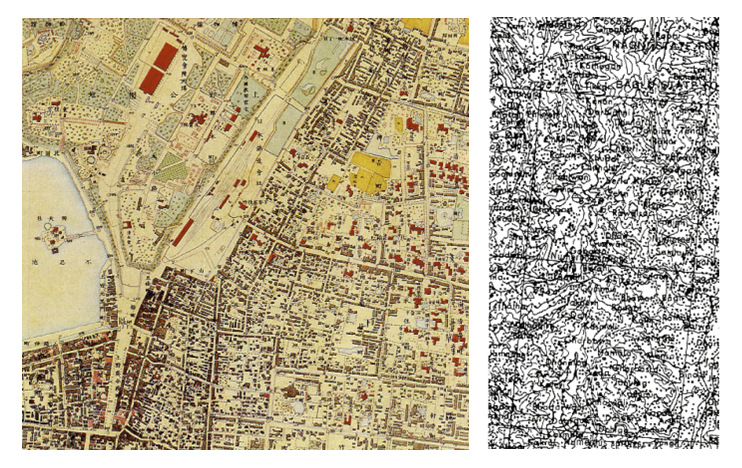
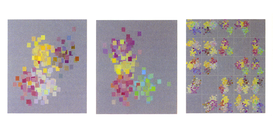
On the left, population density
On the right, number of children per household with black as the most dense
In aggregation, we can see the "day care ring" in the near suburbs of Tokyo.
Layering and Separation
In this next chapter, Tufte asserts that confusion and clutter are failures of design, not attributes of information.
The key is to find design strategies capable of revealing detail and complexity while maintaining clarity - rather than fault the data for an excess of complication.
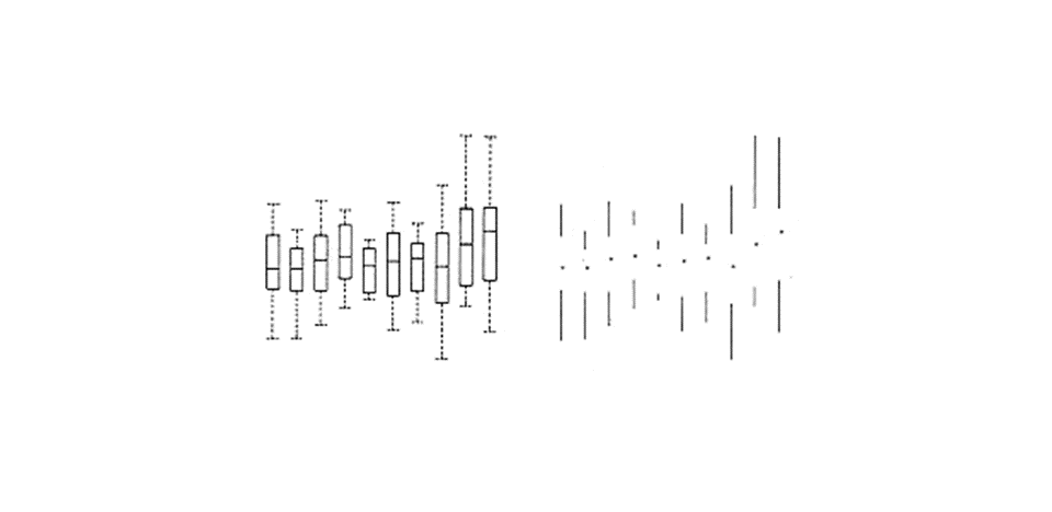
One of the most powerful techniques for reducing noise and enriching the content of a design is "layering and separation": visually stratifying various aspects of the data.
Effective layering is difficult. Here is the problem:
The various elements collected together in flatland interact, creating non-information patterns and texture simply through their combined presence.
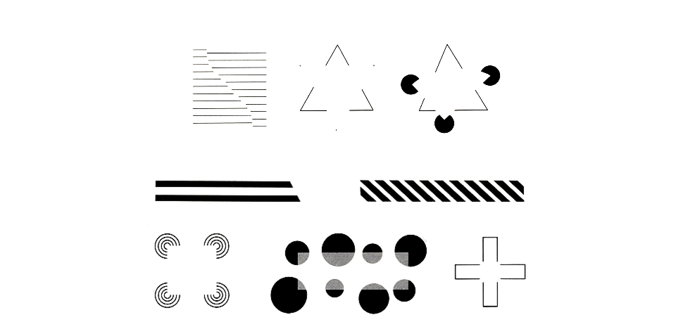
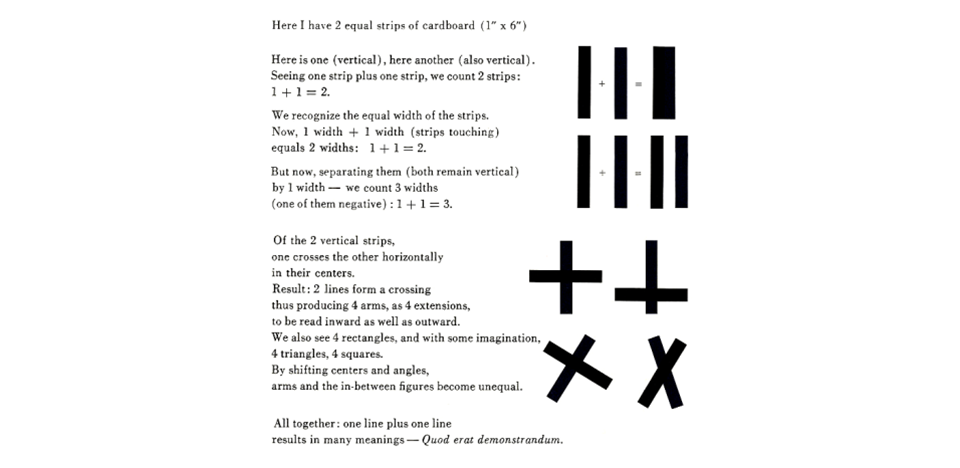
Josef Albers described this effect as 1+1=3 or more.
Color can help to differentiate between layers
Registration lines within a field can contextualize information, but should be read as secondary to the information itself.
In the briefest of treatments of Gestalt systems, which seeks to explain the form-generating capability of our senses, Tufte leans on Josef Albers' principle of "1+1=3 or More".
Here, Tufte invites us to not only recognize the effects of form and perception when composing information graphics, but to actually take average of them to increase the "data-ink" ratio.
Albers talks about "negative space activation"
When left unrecognised, as demonstrated here in what Tufte calls the "worst index ever designed"
When recognized, gestalt effects can be taken utilized to increase "data-ink" ratio.
Small Multiples
At the heart of quantative reasoning is a question: compared to what?
Small multiple designs answers this question directly by visually enforcing comparisons of changes and the scope of alternatives.
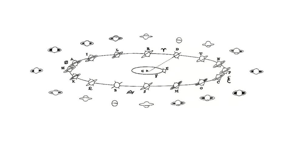
1659 drawing by Christiaan Huygens
The inner elliipse shows earths orbit, the outer saturns - the outermost show saturn as seen by earth
All told we have 32 saturns from the perspective of two different observers - a 'small multiple' design.
Illustrations of postage stamp size are indexed by category or label, and sequenced over time like the frames of a movie.
Information presented within an 'eyespan' so that viewers can make comparisons within a glance.
Color and Information
Color is hard.
Klee: "to paint well is simply this: to put the right color in the right place"
The often scant benefits derived from coloring data indicate that even putting a good color in a good place is a complex matter.
Avoiding catastrophe becomes the first principle in bringing color to information.
First, do no harm.
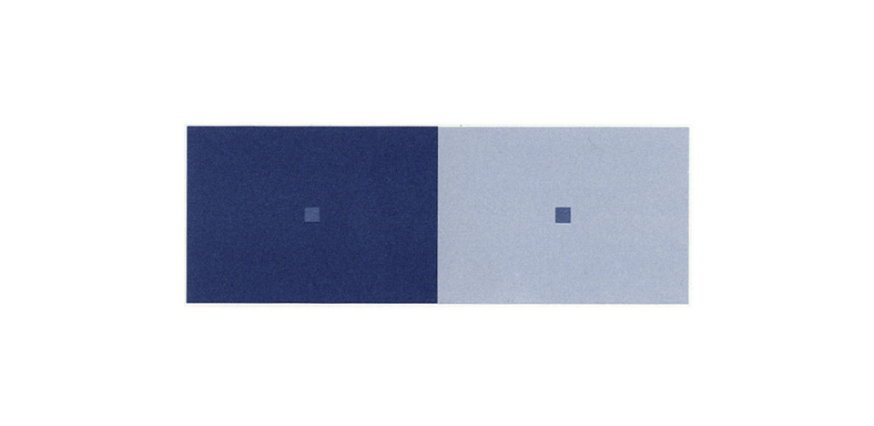
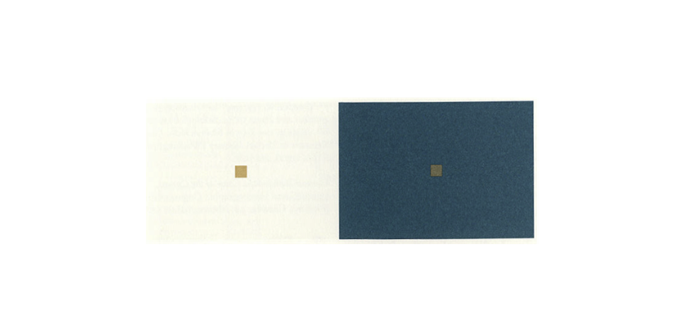
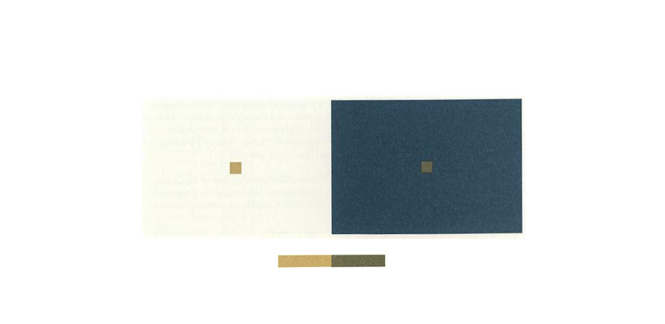
One reason why color is so difficult is that our perception of color is contextual.
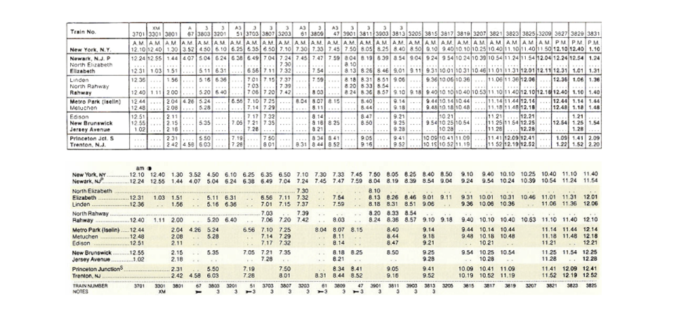
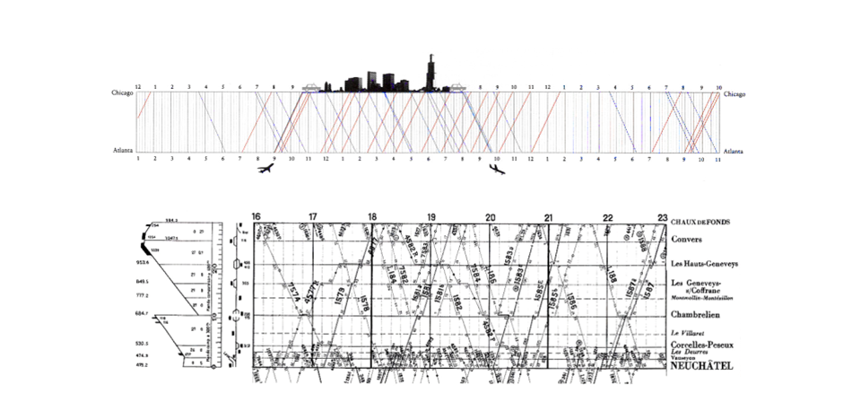
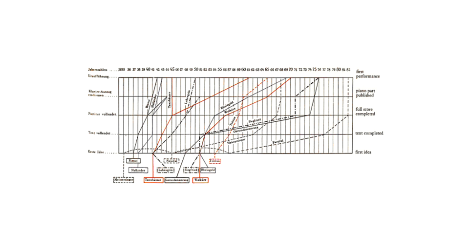
Narratives of Space and Time
Most of the information graphics we've seen so far report on the reality of three-space-time
Painting four-variable narrations of space-time onto flatland combines two familiar designs: the map and the time-series.
Tufte explains narrative graphics by holding constant the underlying information, and seeing how the various designers cope with the common data.
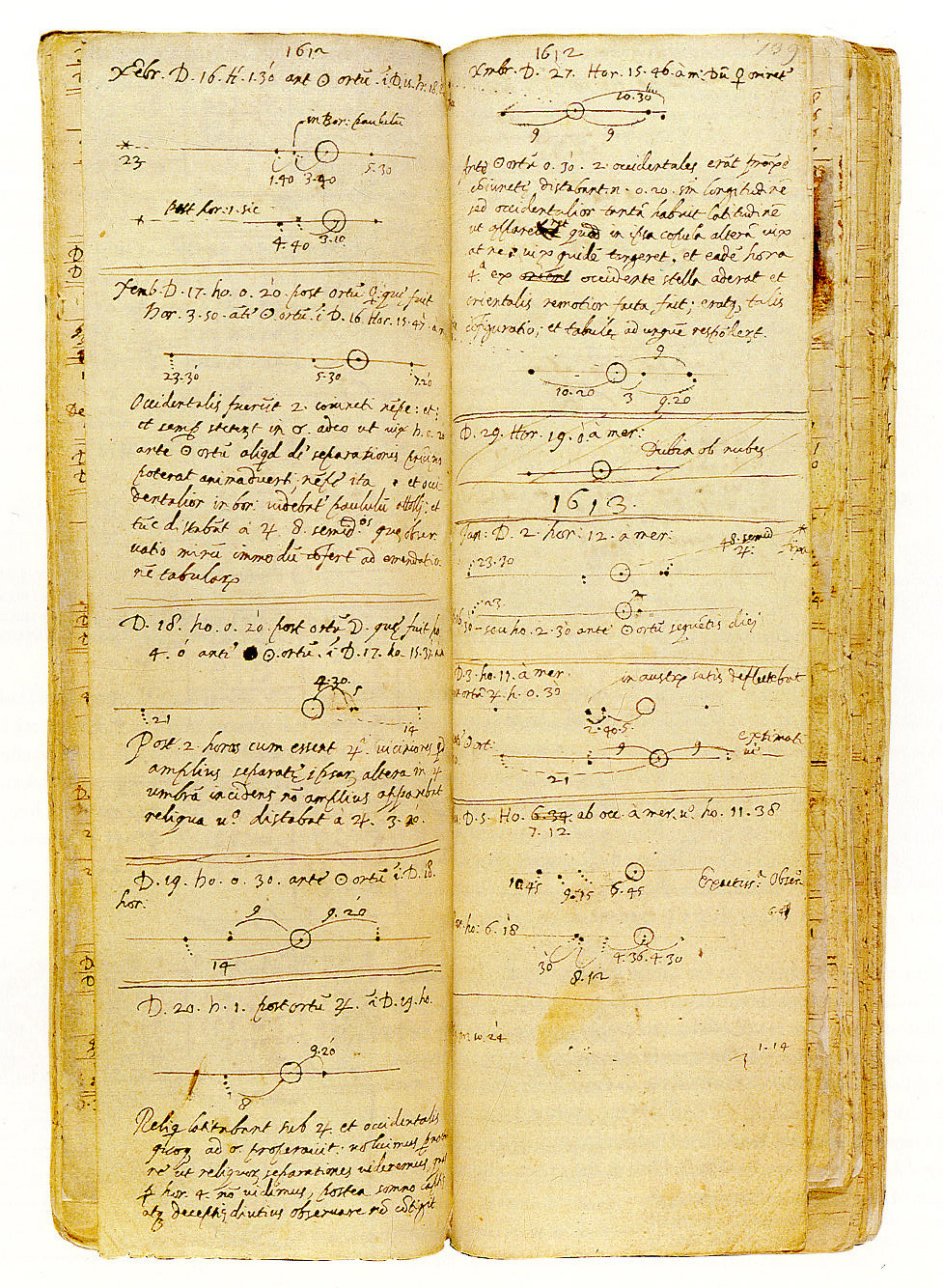
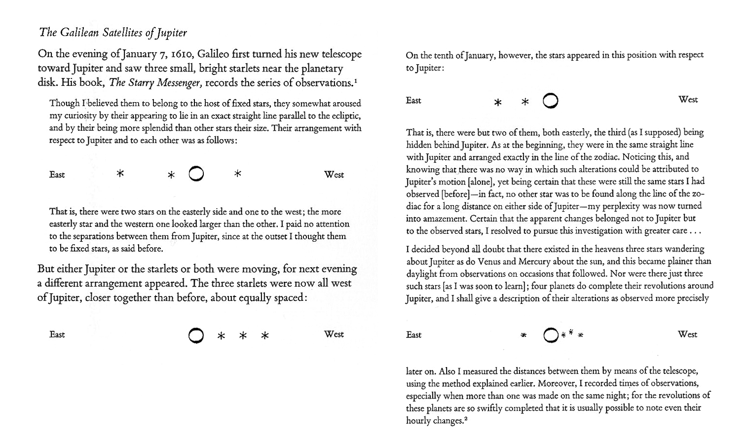
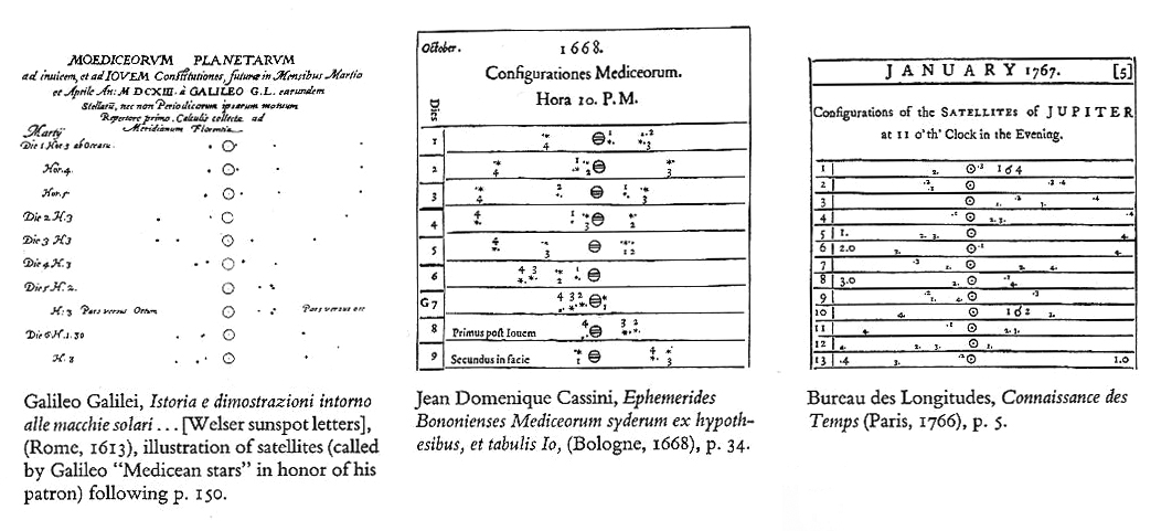
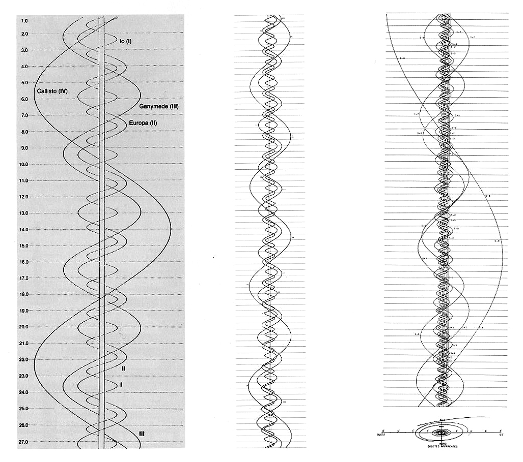
Accounts of Jupiter's satellites.
Itinerary design (schedules and route maps)
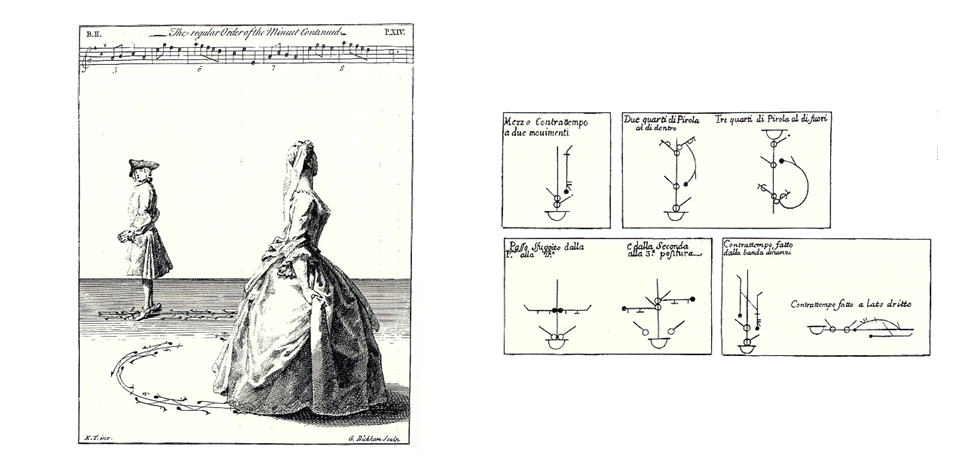
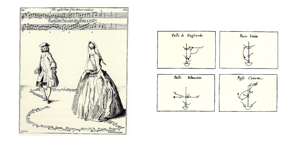
He also does dance notation (but we don't)
Galileo's notes on the observation of Jupiter's moons.
Textual narrative interlaced with small multiple diagrams