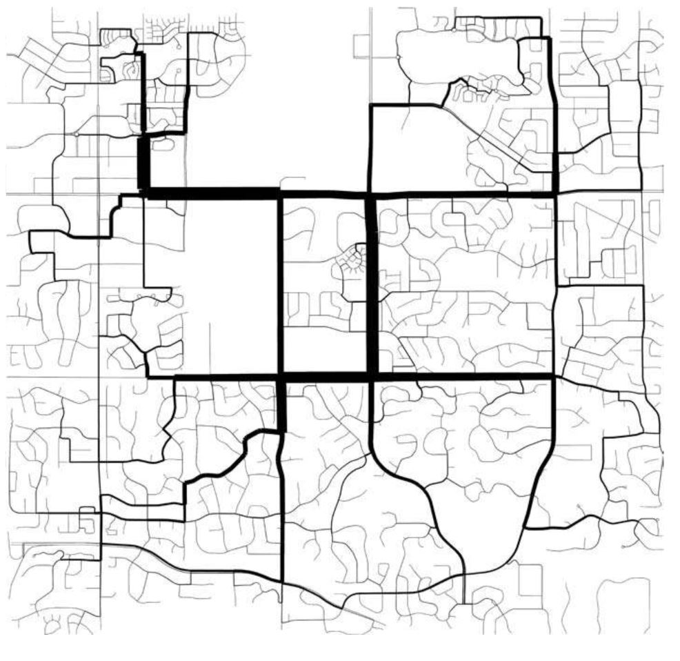
Pablo Miranda Carranza, 2014 Betweenness centrality of Apple Valley, Minnesota, KTH Royal Institute of Technology, Stockholm The width of the roads shows their betweenness centrality, a measure used in network analysis. It is calculated by counting the amount of shortest paths that pass through an edge or node, for all shortest paths from every node to all other nodes. Calculated using the Open Source Boost graph library.
Here we present a discussion of line weight and style, as they are employed in general graphic projection to assist in the creation of the illusion of three-dimensions. Building upon the standards of general graphics projection, architects add their own conventions that include some symbolic notations (such as when drawing a stair or elevator) and will often deviate from the standards discussed here.
A discussion of lineweight comes down to a simple question asked by the author of a given architectural drawing: 'how dark should this line be?' We may observe three separate hurestics for addressing this question, each of which is discussed below:
* Differentiation by Distance
* Differentiation by Form
* Differentiation by Type
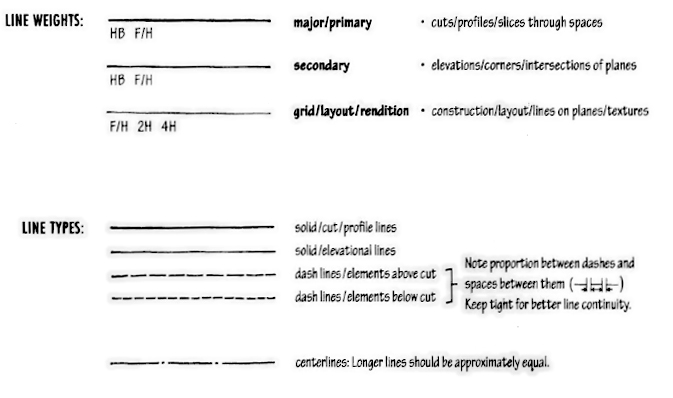
In graphic projection drawings, lineweight refers to the visual weight of a line, typically expressed by the relative thicknesses of a set of black lines, while linestyle (or sometimes 'line type') refers to the differences among the geometry of the line including such properties as continuous, dashed, and dotted.
Conventionally, the "weight" of a line refers to the thickness to which a line is rendered graphically. This basic graphic property has enormous effect upon how a drawing is perceived, and how the illusion of three-dimensional space is produced through two-dimensional drawings.
While grey lines and color lines have become increasingly prevalent in the digital age of hard-line drawing, traditional technical drawing has exclusively employed black lines of varying thickness and type to express form and space.
Given the same set of lines, a variation of their weight can produce radically different illusions of space and form.
Lineweight is critical to the visual legibility and hierarchy of a drawing.
from Ching, Francis. Architectural Graphics. New York: John Wiley, 2003. p37
from Ching, Francis. Architectural Graphics. New York: John Wiley, 2003. p37
In the general application of graphic projection drawing there exist two criteria for the application of line weight to drawings produced by graphic projection that mutually can influence the properties of a line in drawing: one that differentiates lines by distance from the projection plane, and another that differentiates lines by their role in depicting spatial relationships.
In summary, these two rubrics that compete to determine the weight of a line are:
Differentiation by distance (near is heavy, far is light)
Differentiation by form (space-defining is heavy, non-space-defining is light)
Differentiation by type ('real' lines are heavy, symbolic lines are light)
Because the weight of a line must be chosen with its context in mind, including the overall density of the marks on the drawing, the physical context in which the drawing is to be observed (in print media vs on the gallery wall, in full sunlight vs dim artificial light) the specific line weights described in this section are rough estimates only. These are not to be followed strictly or without regard to the context of their application.
Variation by Distance
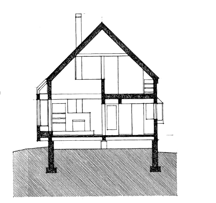
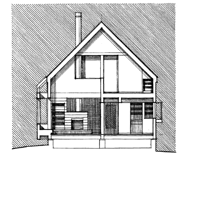
The simplest heuristic for the application of lineweights is that of variation by distance. In applying this convention, we differentiate projected points (and the lines that connect them) by the distance travelled to the draw plane. Those points that have travelled far produce lighter lines, and those that have travelled not-as-far produce darker lines.
from Ching, Francis. Architectural Graphics. New York: John Wiley, 2003. p42
The distance heuristic is most appropriate for drawings in which distance relationships dominate, such as orthographic views including architectural plans, sections, and elevations.
from Ching, Francis. Architectural Graphics. New York: John Wiley, 2003. p43
Variation by Form
An often overlooked (but important) heuristic for the application of lineweights is that of variation by formal relationship. In applying this convention, we examine the role that each line plays in defining form, and apply lineweight in order to create an effective illusion of space.
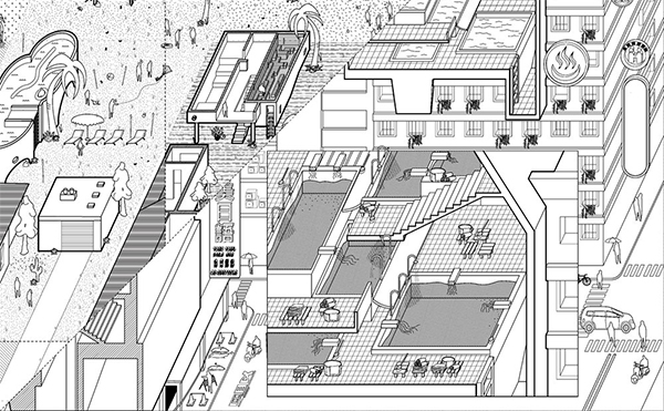
The form heuristic is most appropriate for drawings in which relationships of form dominate, such as axonometric or oblique views.
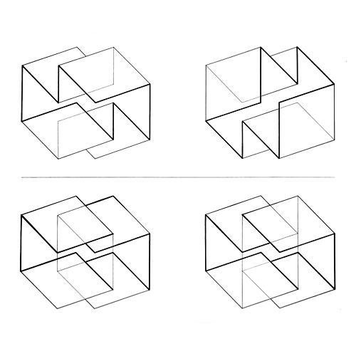
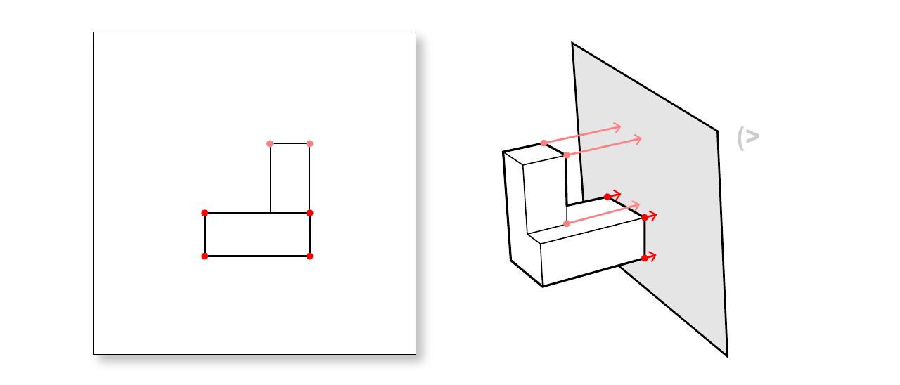
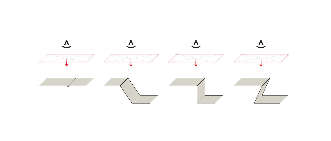
To understand the rules at play in differentiating lines by their role in constructing the illusion of form and space, consider the four situations shown in the nearby diagram.
Line weights in ascending order of thickness: surface lines, fold lines, edge lines, and silhouette lines.
Differentiating lines in this way reveals four distinct types:
Surface Lines that represent non-geometric or relatively minor variations of surfaces, such as changes of material or seams.
Fold Lines that represent an edge between two visible surfaces.
Edge Lines that represent an edge between two surfaces, one of which is visible and the other perpendicular to the view direction.
Silhouette Lines that represent an edge between two surfaces, one of which is visible and the other hidden.
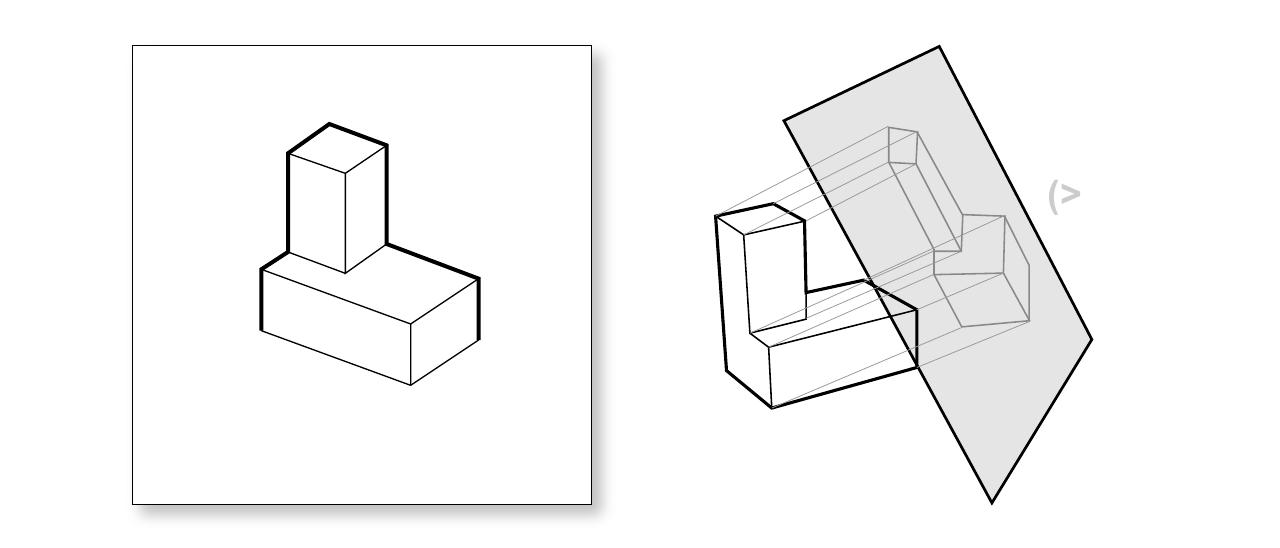
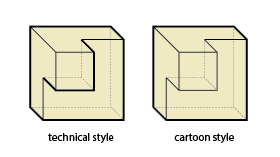
"technical style" vs "cartoon style" of silhouette lines
This last category, silhouette lines, is the source of difficulty and a bit of disagreement in the architectural design community.
We can understand that silhouette lines are those lines that demarcate the difference between two surfaces that are separated from one another by some distance. Put another way, a silhouette is any line with "space behind it". This is in contrast with surface lines and edge lines which distinguish two surfaces along an edge that joins them.
Following this definition, a silhouette line might describe two conditions:
Those lines which bound the overall figure against the background.
Those lines that bound some element of a form that is spatially separated from but visually overlapping with other elements of that form.
This latter category is not universally treated as a silhouette, as can be seen in the difference between "technical style" and "cartoon style" applications of line-weight in axonometric in the nearby image.
Variation by Type
Our final heuristic for the application of lineweights is that of variation by type. Here we differentiate between the 'normal' set of lines that describe visible edges of a graphic projection from a number of other 'special' lines that are required by the conventions of technical drawing.
We list here a number of special types of lines that demand the application of a particular lineweight, from lightest to darkest:
Construction Lines that do not describe the form in question, but are used in the creation of other lines or to show relationships. This includes registration lines, alignment lines, or lines that describe the underlying geometric logic of a form.
Symbolic / Information Lines that communicate additional information about a form. This includes depictions of actions (such as the path of moving elements like door swings), organizational marks (such as center lines), notes and leaders (such as dimensions), and domain-specific symbolic marks (such as architectural section lines and break lines).
Hidden Lines that define forms that is not visible in the projected view, but that are rendered in the drawing nonetheless. This includes forms or edges that are obscured by other objects as well as important edges that lie "behind" the draw plane (which are included only at the discretion of the author).
Visible Lines that generally adhere to the normal conventions of graphic projection, and that are assigned a weight using a combination of the distance and form heuristics.
Cut Lines that delineate the intersection of the cut plane and any objects that pass through it.
The initial lines of the drawing that help to lay out the drawing on the page and create the basic geometry and guides for the rest of the drawing. These lines are to be drawn very lightly - dark enough for you to see while drawing, but delicate enough to be easily erased later. Though these lines are typically erased for construction documents, they may be found in presentation drawings to assist the viewer in graping the salient relationships at work. Though these are light lines, it's important to remember that these are still intended to be visible - do not confuse "light" with "hard to see."
6H-4H, 0.125 - 0.20 pt
Symbolic / Information Lines
IBM Series III Copier I Duplicator, Adjustment Parts Manual (Boulder, Colorado, 1976), p. 101. Drawn by Gary E. Graham. From Tufte, Edward R. Envisioning Information, p54. Cheshire, Connecticut: Graphics Press, 1990.
Action lines that show movement, such as door swings.
Leader or Annotation Lines that connect notes or references to objects or lines in a drawing. These are solid lines that end in an arrowhead, and may be straight, angled, or curved as necessary.
Break Lines that are used when the extents of a drawing cannot fit into the drawing frame, or when only a portion or partial view of a design is necessary. Also used to illustrate stairs that emerge out of the sectional plane of a drawing.
Center Lines that indicate the center of a plan, object, circle, arc, or another symmetrical object.
Section Flag Lines that indicates the sectional plane for a cutaway view on a drawing, as well as the viewing direction of the associated view.
Dimension Lines that depict measurements of an object.
4H-2H, 0.25 - 0.40 pt
Hidden Lines
2H-H, 0.30 - 0.50 pt
Visible Lines
Includes the majority of lines in a drawing, including: Outermost boundaries of forms, or those "silhouette lines" that border empty space or separate the figure of the depicted object from the ground; Primary elements, such as edge and fold lines; Surface lines; Secondary objects such as doors, furniture, cabinets, and other non-structural architectural features.